Below is a copy of the script I gave my actors to work with whilst I was filming for my trailer.
Jordan: I can't believe it. Finally, those 2 years are over
Caleb: Yeah we should definitely celebrate
Jordan: Are you think what I'm thinking?
Caleb: Yes!
(Outside remote old, trashed house)
Caleb: What a dump
(Knocking on door)
Caleb: Hello?
(Turns, looks around and shouts)
Jordan:Hello?
Friday, 4 May 2012

Motion Magazine
Motion Magazine

Above is the final edit of my magazine "Motion" and there front cover featuring my film "Indigenous".
Indigenous Poster
Indigenous Poster

Above is the final edit of my film poster which is one of the ancillary tasks that accompanies my trailer.
Tuesday, 6 March 2012
Shot List
Shot list
Below is a list of shots I am planning to use and include in my film trailer. The more planning and preparation that goes in to my film the more successful and well received it will be.
Shot list for “Indigenous”:
High angled shot – Shot looking down towards the victims of the film
Low angle shot – Shot looking up toward villain to connote the power he holds over the situation.
Over the shoulder shot – Shot including dialogue flowing between characters.
Extreme close shot – Shot to show the emotions of different characters.
Close shot – Shot again used to show characters when in dialogue scenes
Establishing shot – Shot to set the scene for the film trailer.
Panning shot – Shot used to explore the scenery. Further panning includes sight of something sinister (e.g. Gun, axe, villain).
Cut in – Shot to show something one of my characters are seeing (e.g. getting a text and revealing what it says).
Long shot –Shot to include more of the characters (including characters at beginning of trailer to show them happy and excited about going away).
Medium close shot – Shot showing the character from the waste up. Used to show character of Jason clutching pole as a weapon.
Medium long shot – Shot showing a conversation between two characters towards the start of the trailer.
Worms eye view – Again used to look up at the villain connoting power and making the villain appear more menacing.
Tracking shot – Shot following the characters movement where I plan to cut to an extreme close shot to show the emotions of the character.
Prop List
Prop List
Below is a list of props that I need in order to construct my film trailer:
- · Gun
- · Axe
- · Car
- · Ammunition belt
- · Pole
Equipment
Equipment
This is a list of equipment I require for my film trailer:
- · Canon EOS 600D
- · Tripod
- · Steady cam
- · Take board
- · Handheld light source
Friday, 2 March 2012
Production Company Research
Production Company Research
In order to get a better idea of what I need to create a successful, professional standard production company logo. I will then gain a better understanding of the common conventions within them.
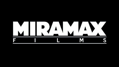
Miramax – The Miramax logo uses a simplistic design with a plain black background. The main focus of the logo being the text itself. The word "Miramax" is in a bold large font as this is the most important piece of information that the audience need. It also uses this text as the basis for the word "Films" which stretches across to fit the length of "Miramax" connoting Miramax has power regarding this film. The word "film" is then framed with a line above and below the text connoting a screen from which movies are played.
 Lionsgate - The Lionsgate logo is usually shown as it is pictured above right. However, as different production companies often do, they have adapted their logo in order to add to the fear factor of the horror film they appear on.

This production company uses generic horror conventions such as the smokey red background connoting danger and evil. The silver lettering is also bold with the text edited to give a steel look to it with outlining bits of red almost giving the impression of stained blood. This is connotes a bloody knife which is a popular murder weapon amongst the horror genre. This also acts to really make the lettering stand out among the background and centre it.

New Line Cinema - This is one of the production companies that is well associated with the horror genre. Again it is another fairly simplistic logo with a plain black background. The main image in this logo being the piece of film, which is centred in the middle so that it is one of the first things, your eye is drawn to. The blue illuminous light placed behind the picture connotes mystery and unease that goes hand in hand with the horror genre. The text "New Line Cinema" is placed under the picture in a large bold font so it is immediately known to the audience that this is the most important piece of information and the company then becomes well known in their mind.
Subscribe to:
Posts (Atom)