Production Company Research
In order to get a better idea of what I need to create a successful, professional standard production company logo. I will then gain a better understanding of the common conventions within them.
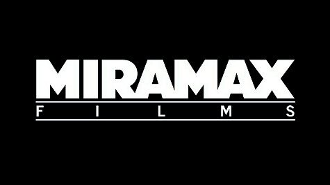
Miramax – The Miramax logo uses a simplistic design with a plain black background. The main focus of the logo being the text itself. The word "Miramax" is in a bold large font as this is the most important piece of information that the audience need. It also uses this text as the basis for the word "Films" which stretches across to fit the length of "Miramax" connoting Miramax has power regarding this film. The word "film" is then framed with a line above and below the text connoting a screen from which movies are played.

This production company uses generic horror conventions such as the smokey red background connoting danger and evil. The silver lettering is also bold with the text edited to give a steel look to it with outlining bits of red almost giving the impression of stained blood. This is connotes a bloody knife which is a popular murder weapon amongst the horror genre. This also acts to really make the lettering stand out among the background and centre it.

New Line Cinema - This is one of the production companies that is well associated with the horror genre. Again it is another fairly simplistic logo with a plain black background. The main image in this logo being the piece of film, which is centred in the middle so that it is one of the first things, your eye is drawn to. The blue illuminous light placed behind the picture connotes mystery and unease that goes hand in hand with the horror genre. The text "New Line Cinema" is placed under the picture in a large bold font so it is immediately known to the audience that this is the most important piece of information and the company then becomes well known in their mind.
No comments:
Post a Comment